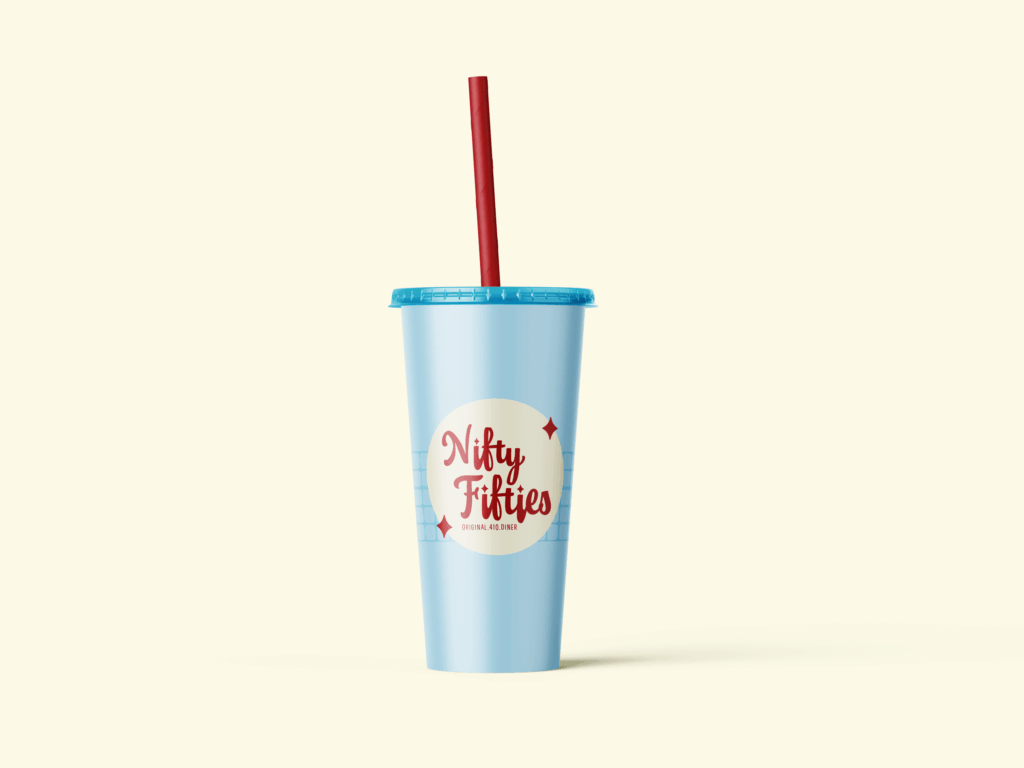
Nifty Fifties
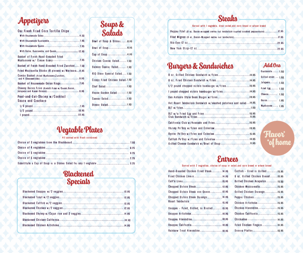
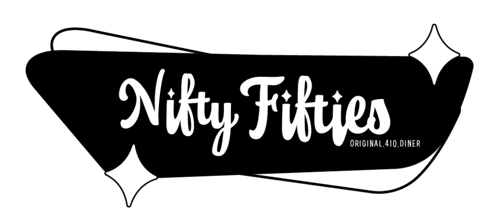
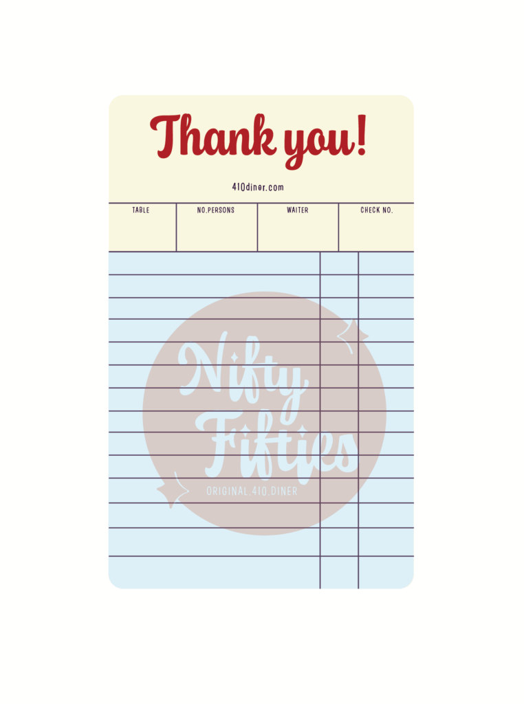
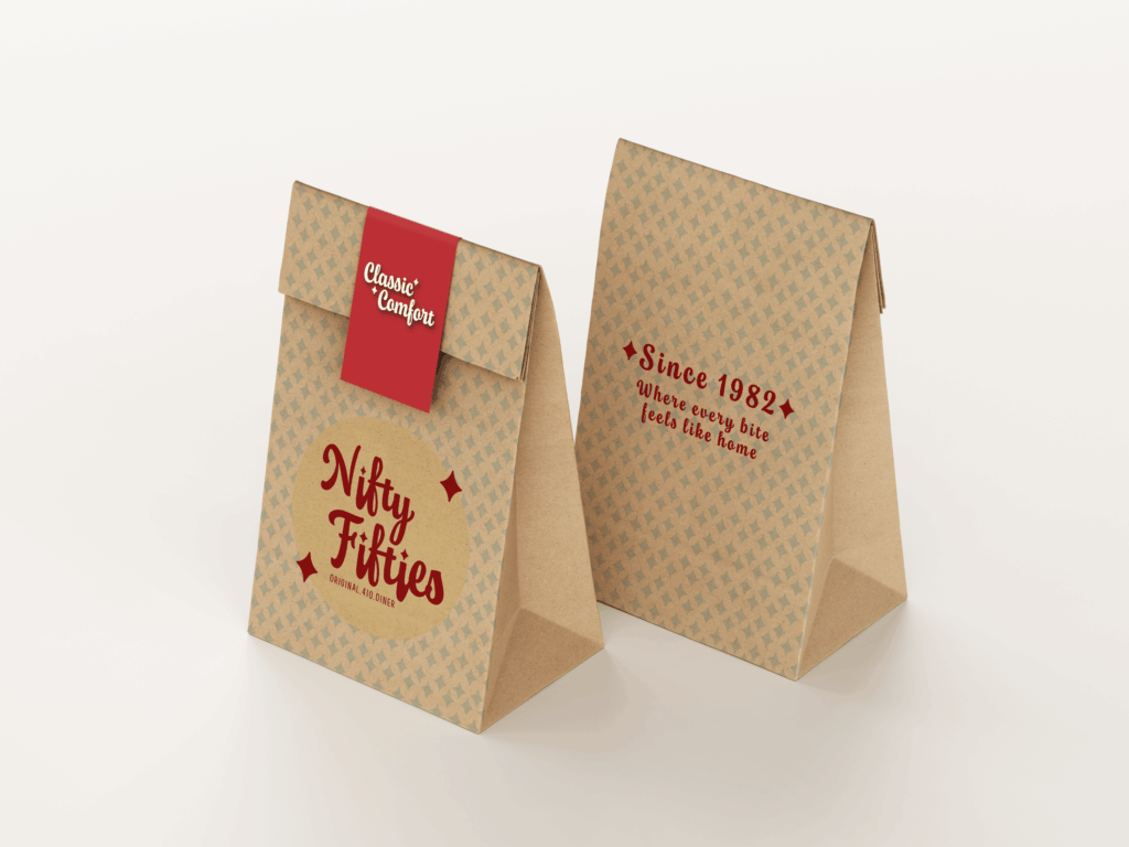
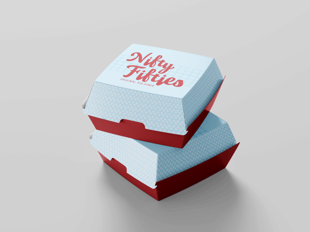
Nifty Fifties is a restaurant rebrand focused on refreshing the visual identity of a retro-inspired dining experience while maintaining its nostalgic charm. The project explored how typography, color, and packaging could reinforce the restaurant’s 1950s theme while improving visual consistency and brand recognition. The goal was to create a system that felt playful, memorable, and reflective of the diner’s personality.

Process
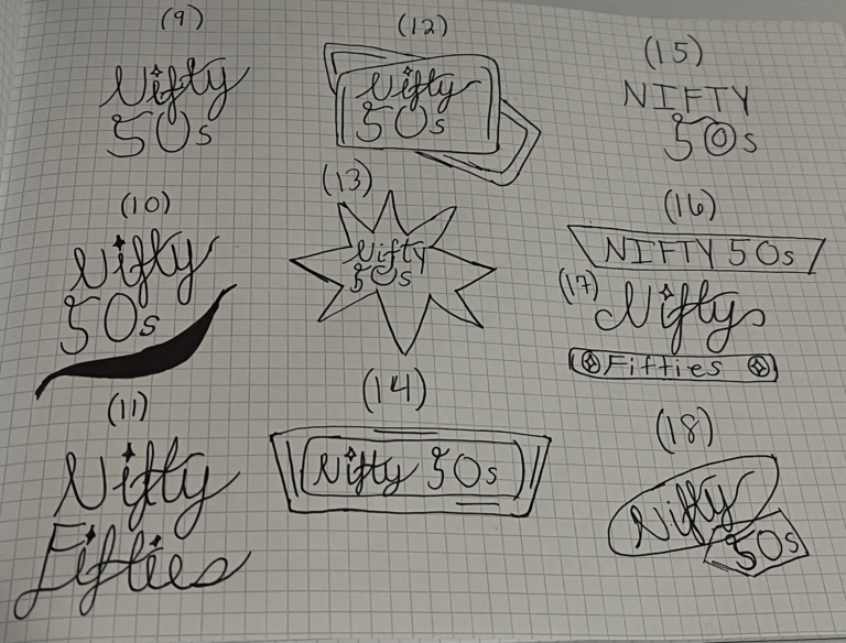
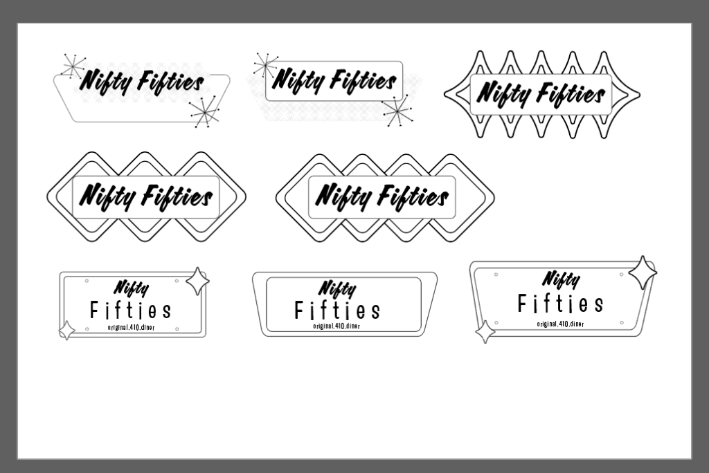
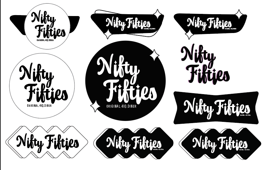
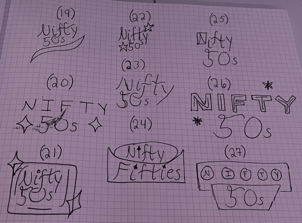
The process began with research into 1950s diner culture, including typography styles, color palettes, and vintage advertising aesthetics. Initial exploration focused on developing logo concepts and visual elements that captured the theme while improving clarity. Once a direction was selected, the identity was expanded into packaging applications and branded materials. Iteration focused on ensuring the brand felt both authentic and functional.
Brand System
Final System
Interested in working together?